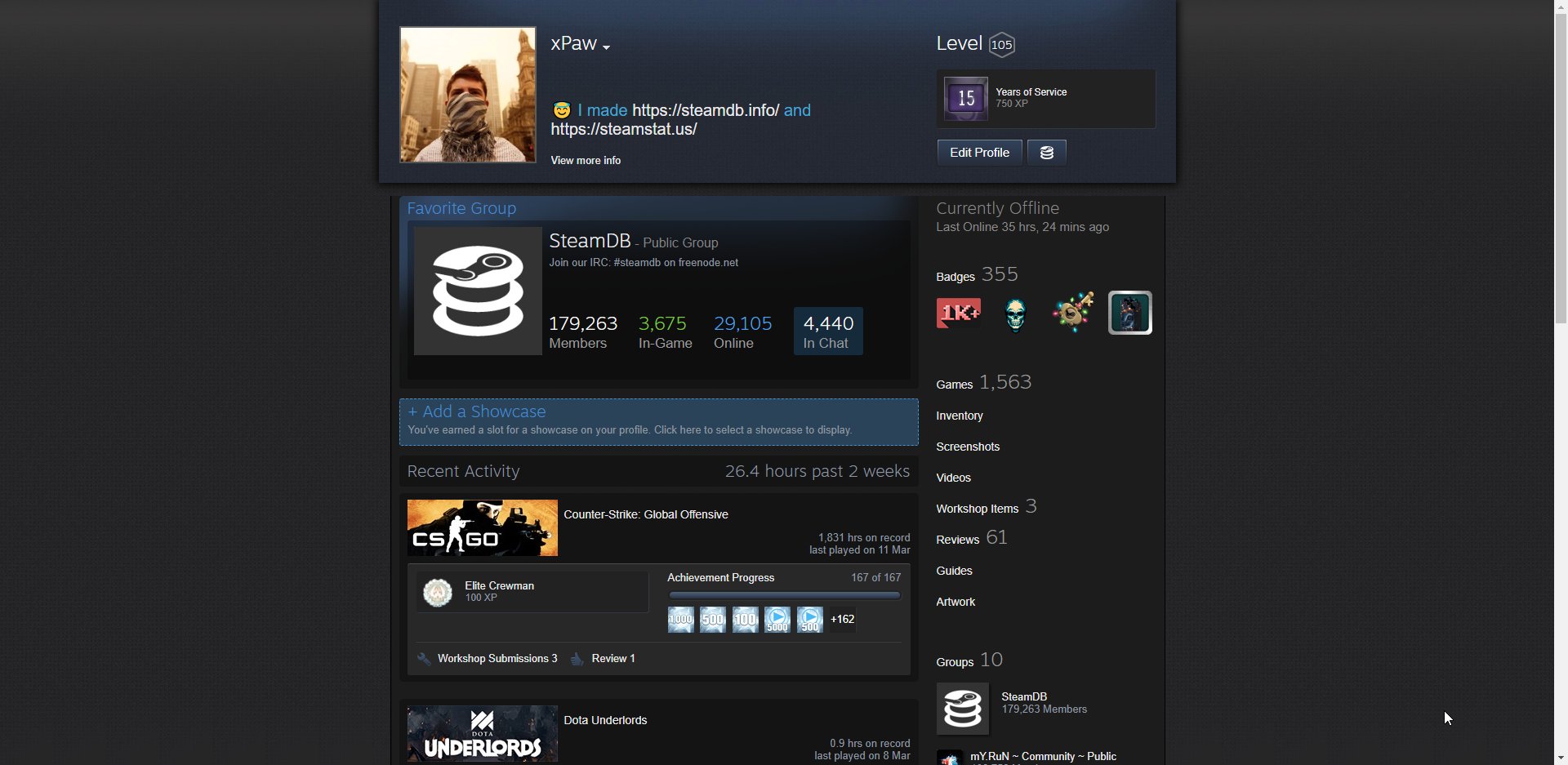
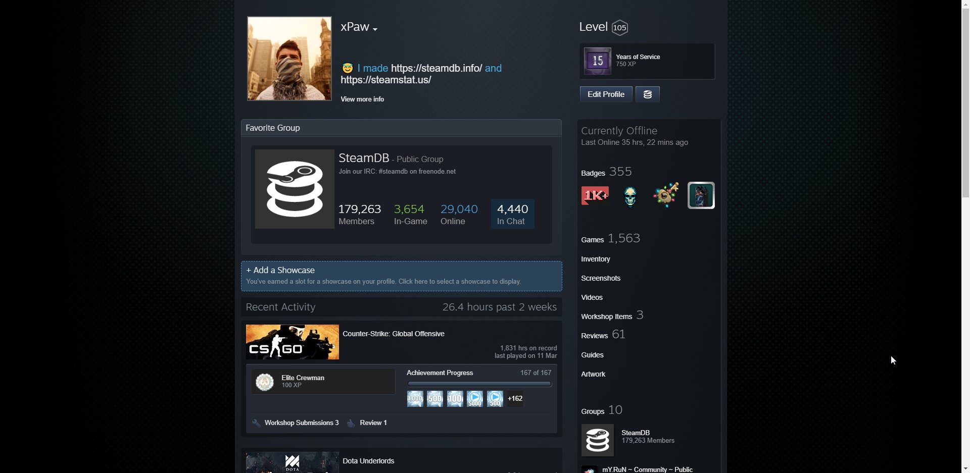
PREVIEW YOUR OWN PROFILE:
(Disable addons like Augmented Steam first)

javascript:(function(){jQuery(".has_profile_background").toggleClass("has_profile_background");jQuery("head link[rel=stylesheet]").remove();jQuery("head").append('<link href="https://steamcommunity-a.akamaihd.net/public/shared/css/motiva_sans.css?v=FAK4O46_mOLB&amp;l=english" rel="stylesheet" type="text/css" > <link href="https://steamcommunity-a.akamaihd.net/public/shared/css/buttons.css?v=6uRURryOh96m&amp;l=english" rel="stylesheet" type="text/css" > <link href="https://steamcommunity-a.akamaihd.net/public/shared/css/shared_global.css?v=eHg2oFGho5Gm&amp;l=english" rel="stylesheet" type="text/css" > <link href="https://steamcommunity-a.akamaihd.net/public/css/globalv2.css?v=NxHTqp2J_7zD&amp;l=english" rel="stylesheet" type="text/css" > <link href="https://steamcommunity-a.akamaihd.net/public/css/skin_1/profilev2.css?v=U0s9enNfheek&amp;l=english" rel="stylesheet" type="text/css" > <link href="https://steamcommunity-a.akamaihd.net/public/shared/css/motiva_sans.css?v=FAK4O46_mOLB&amp;l=english" rel="stylesheet" type="text/css" > <link href="https://steamcommunity-a.akamaihd.net/public/shared/css/shared_responsive.css?v=Zo1pXmF7n6Yo&amp;l=english" rel="stylesheet" type="text/css" > <link href="https://steamcommunity-a.akamaihd.net/public/css/skin_1/header.css?v=Bv4kKK3Pxl5t&amp;l=english" rel="stylesheet" type="text/css" >');})()
View attached image.
4 years ago*

Comment has been collapsed.

Like it?

View Results
Yes
No
Potato
Deleted

This comment was deleted 3 years ago.

4 years ago
Permalink

Comment has been collapsed.

I was wondering the exact same thing.

4 years ago
Permalink

Comment has been collapsed.

Can't see anything different.
We must be blind O.o

4 years ago
Permalink

Comment has been collapsed.

I wonder how much Time/money valve has spent for this^^

4 years ago
Permalink

Comment has been collapsed.

Attached image not working :'(

4 years ago
Permalink

Comment has been collapsed.

No thanks.

4 years ago
Permalink

Comment has been collapsed.

I actually liked it until I noticed that the background will not appear behind the thing on the right and stuff, oh well

4 years ago
Permalink

Comment has been collapsed.

don't see anything different even with gsync enabled

4 years ago
Permalink

Comment has been collapsed.

mambo jumbo

4 years ago
Permalink

Comment has been collapsed.

Doesn't really look much different, but still sligthly worse than what we have now. Thanks, but no thanks.

4 years ago
Permalink

Comment has been collapsed.

dont see any changes...

4 years ago
Permalink

Comment has been collapsed.

bump

4 years ago
Permalink

Comment has been collapsed.

Somebody check this "code" for rootkits.)

4 years ago
Permalink

Comment has been collapsed.

Yes, please do.

4 years ago
Permalink

Comment has been collapsed.

Someone posted comparisons on Reddit. Have a look if you don't feel like going to the "trouble" of pasting code. I wouldn't have noticed the change personally

View attached image.
4 years ago
Permalink

Comment has been collapsed.

Thanks, this comparison at least shows something :D

4 years ago
Permalink

Comment has been collapsed.

It's like playing Find the Difference, took a bit of looking to see the changes.

4 years ago
Permalink

Comment has been collapsed.

Valve making a 3D-chess move. Your profile is now also a game

4 years ago
Permalink

Comment has been collapsed.

Find Waldo.

4 years ago
Permalink

Comment has been collapsed.

I does look better... but yeah, I'd probably not notice that either if I wasn't told about it.

4 years ago
Permalink

Comment has been collapsed.

Deleted

This comment was deleted 3 years ago.

4 years ago
Permalink

Comment has been collapsed.

A little more flat, less use of gradients. It does make it look more modern. Not by a lot though.

4 years ago
Permalink

Comment has been collapsed.

they finally aligned it. just one big rectangle now. also nice they go back to grey header again.
hopefully bpm revamp soon

4 years ago
Permalink

Comment has been collapsed.

Barely a difference? Shame the comparisons don't show effect on bg, not going to run something to preview.

But after the absolute MESS that is their new library (revert ftw!) I guess the less they mess up the layout the better.

4 years ago
Permalink

Comment has been collapsed.

Considering that difference is not big, I like it, but I will not like it that small update to borders and size makes some mess with our artworks and customization profiles that we had set up, there are many steam users who put a lot of effort into their profile so I hope keeps that in mind when it comes to this profile update.

4 years ago
Permalink

Comment has been collapsed.

So... flat design that's still not filling more of the screen or respond to resolution.

Hope it does not mean profile will suffer from the same performance problems new library is. It was barely usable on my old laptop.

Also they could finally do something useful, like change this bad code of /all games. If they have so much problem to show data of 10k games on profile, they should add page pagination and load only first page on demand

4 years ago
Permalink

Comment has been collapsed.

Is it still wallpaper compatible?

4 years ago
Permalink

Comment has been collapsed.

Deleted

This comment was deleted 1 year ago.

4 years ago
Permalink

Comment has been collapsed.

Deleted

This comment was deleted 3 years ago.

4 years ago
Permalink

Comment has been collapsed.

I personally use this, and i think it is awesome. Give it a shot

https://userstyles.org/styles/115739/dark-steam

4 years ago
Permalink

Comment has been collapsed.

As a somewhat unintuitive effect of how the brain works most people are going to be far more interested in how their profile looks to other people than how they can make it look to themselves.

4 years ago
Permalink

Comment has been collapsed.

Looks like i am not one them :D

I use offline random background changer (that i created myself) as well. 20-30 images changing randomly when i use it. It kinda pointless to spend money on bg imo.

4 years ago
Permalink

Comment has been collapsed.

Tried it and it messes up my profile more than I've seen in the screenshot. If it really ends up looking like this for me, I'll be pretty pissed.

View attached image.
4 years ago
Permalink

Comment has been collapsed.

Deleted

This comment was deleted 1 year ago.

4 years ago
Permalink

Comment has been collapsed.

Beats me, that's my biggest gripe with this. But they don't seem to be nowhere near as prominent on the screenshot OP posted.

4 years ago
Permalink

Comment has been collapsed.

Deleted

This comment was deleted 4 years ago.

4 years ago
Permalink

Comment has been collapsed.

![](LINK)

For other comment formatting go here.

4 years ago
Permalink

Comment has been collapsed.

hope they didn't mess up all like they did with the awful chat..why change things if they works good i don't rellay know.

4 years ago
Permalink

Comment has been collapsed.

Because Valve likes to fix things until they break, not fix what's already broken.

4 years ago
Permalink

Comment has been collapsed.

Deleted

This comment was deleted 11 months ago.

4 years ago
Permalink

Comment has been collapsed.

Sign in through Steam to add a comment.