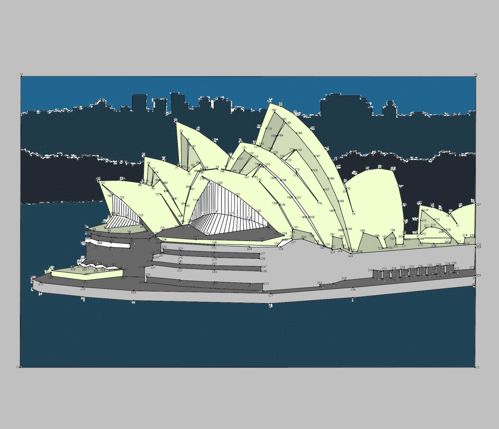
The White House & The Opera House. Vote for your favourite submissions of the week! [GAs inside]
Voting on these has become one of my favorite things.
Comment has been collapsed.
More of a "even more shared love for SG's artists" event. :)
The dot-challenges isn't as much of a competition as it is a positive place to be friendly with each other and show appreciation. The voting is more of a side thing to keep it a bit interesting.
Comment has been collapsed.
Comment has been collapsed.
Those give something decent, my picture is what I get when I click the picture on the voting site.
Comment has been collapsed.
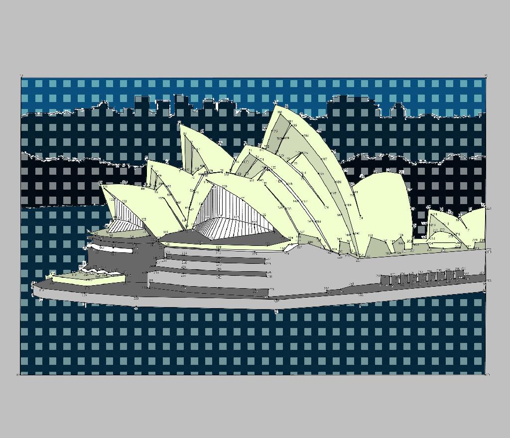
It changes image depending on browser size to decrease loading times. Try maximizing the window, or view it on a computer that supports higher resolutions if you're on a small size laptop or something. You're seeing the 1024px wide version (attached to this post).
Oh, and I finally remembered the name of the effect, it's called Moiré patterns!
Link to original full size isn't possible at the moment. That way of viewing the gallery bugged out in an update recently, so this is the best option for now. (Or actually, there's been an update since, will check if it's solved the bug)
Edit: Nopes, still bugging out. It would have worked if everyone kept the original image's proportions because I can hardcode the size the other mode uses, but because people cut off the sides, or used scanned images, etc, what works for one image may not work for the next.
The options for the other mode says "Scale" or "Scale and cut". In the first you only select a width, in the second both width and height. What the first option should do is basically scale the image down to whatever you set it to, but it cuts it to that instead and keeps the full height.
Interestingly enough, the same update that introduced that bug is the same that fixed some scaling issues we had in the gallery view.
If you want to look at the full size version of any image, right-click the image you want to look at and select "View image", in the filename, remove the last bit that tells the width of it, for example "-1024width", before .jpg. So "1478446367_18-operahouse-phoxy-1024width.jpg" would become "1478446367_18-operahouse-phoxy.jpg"
Comment has been collapsed.
Meh, in Russia that's normal. In Kyrgyzstan... Well, I've never voted 'cause I don't see difference between parties or candidates.
Nationalists never won, so I shouldn't worry about them, and all others are just bunch of similar jerks.
On other hand, in 10 years I took a part in 2 political upheaval which were called 'velvet revolutions'.
Comment has been collapsed.
[Lootboy] Codes for coins/diamonds -----> Warn...
47,479 Comments - Last post 3 hours ago by eeev
[IndieGala] Assemble with Care - $0.79 (90% off...
6 Comments - Last post 4 hours ago by Tronics
Rise of the Tomb Raider with 90% discount on Steam
8 Comments - Last post 4 hours ago by DeliberateTaco
[Humble Bundle] Critter Chaos Bundle🐶
10 Comments - Last post 4 hours ago by jiggakills
[FREE][STEAM] The Surge (at Lenovo/Gamesplanet)...
595 Comments - Last post 5 hours ago by ShannonA81
[STEAM] Hades (66% off | 8,33€ - Historical Low)
22 Comments - Last post 5 hours ago by eeev
【🖥️ Epic Games】Freebies List|2025-09-11 - 🎮 GR2...
1,009 Comments - Last post 6 hours ago by MeguminShiro
Best way to level up CV?
3 Comments - Last post 19 minutes ago by Yamaraus
Duquality aka 2X Will Be Returning
61 Comments - Last post 40 minutes ago by FateOfOne
[OPEN] Relaxed Giveaway Group
74 Comments - Last post 1 hour ago by Patxxv
Borderlands and Wonderlands SHiFT/VIP codes
1,302 Comments - Last post 1 hour ago by Eremeir
Official last movie you saw thread
10,421 Comments - Last post 1 hour ago by Mortvie
Rosayde's Arcade Giveaways Groups
56 Comments - Last post 2 hours ago by LisekChytrusek
Orphan keys drop thread
30,925 Comments - Last post 2 hours ago by hoangmarcel


Please use all 3 of your votes on each link!
VOTE here for 3 White Houses that you especially like
VOTE here for 3 Sydney Opera Houses that you especially like
Note: Everyone is encouraged to vote, not just participants. Also notice the thanks at the bottom of the voting pages, they are GAs. :)
COUNTDOWN TO Closing of Voting on Week 9!
This weeks challenges: The Alps and The Secret Challenge. We'd love to have your submission!
Bonus host points
Each week the two hosts gets to pick 1 image from each challenge and reward 5 bonus points in their challenge, and 3 bonus points in their co-host's challenge. These were the picks and motivations for week 8:
Swift:
There was a lot of awesome entries. Two of them impressed me the most. Nordhbane's 3D Model was
just awesome and a lot of work. 5 Points
My 3pointer definetly goes to Metalhead8489. I love the Eddy in the sky. Nuff said \m/
1000mgGinseng:
The Golden Gate Bridge I have to give to jeffhowe, elaborate mind blowing effort! 5 points.
For the Stonehenge it was Kasia's work that just popped out of the norm. A Visual Treat! 3 points.
Thanks to everyone for their efforts!!!
Current leaderboard
I've done some work on the leaderboard to give people a better overview. Let me know what you think of the new style and if there's anything I can change to make it look better.
And finally, the two winning submissions of Week 8:
Comment has been collapsed.