Welcome to the fifth week of the Connect-the-dot and Coloring event lasting 12 weeks with each week 2 new connect-the-dot challenges!

Previous Weeks: Big Ben, Eiffel Tower, Sagrada Familia, St Marks Square, Bridge of Sighs, St.Peter's Basilica, Neuschwanstein, Parthenon
Voting and Leaderboard Thread is HERE

This week the landmark for this thread is:

The Taj-Mahal in JPG format

The Taj-Mahal in PDF format

Simply print the jpg or pdf (or use paint programs) and complete the connect-the-dots and submit your finished picture in this thread! For participating you will be invited to a special Steam group for GA rewards!

Here is an example:
Example of completed Dot-to-dot -St. Basil's Cathedral in Russia
Example of COLORED Dot-to-dot -used colored pencil, adding some detail

If you want to accept the ultimate challenge then add some coloring to your picture for next week voting will be done on colored submissions for winners and special GA entry!

Check HERE for details on your submissions and the event!

And don't miss out on the other challenge this week of the Kizhi Pogost!

The Taj-Mahal Challenge!

Where: Agra, India
What: The Taj Mahal is an ivory-white marble mausoleum on the south bank of the Yamuna river
in the Indian city of Agra. It was commissioned in 1632 by the Mughal emperor, Shah Jahan,
to house the tomb of his favourite wife, Mumtaz Mahal.

The complex is believed to have been completed in its entirety in 1653
at a cost estimated at the time to be around 32 million rupees,
which in 2015 would be approximately 52.8 billion rupees (US$827 million)

The construction project employed some 20,000 artisans under the guidance
of a board of architects led by the court architect to the emperor, Ustad Ahmad Lahauri.

The Taj Mahal incorporates and expands on design traditions of Persian and earlier Mughal architecture.
While earlier Mughal buildings were primarily constructed of red sandstone,
Shah Jahan promoted the use of white marble inlaid with semi-precious stones.
Buildings under his patronage reached new levels of refinement.

The most spectacular feature is the marble dome that surmounts the tomb.
The dome is nearly 35 metres (115 ft) high which is close in measurement to the length of the base,
and accentuated by the cylindrical "drum" it sits on which is approximately 7 metres (23 ft) high.
The dome and chattris are topped by a gilded finial which mixes traditional Persian and Hindustani
decorative elements.The main finial was originally made of gold but was replaced by a copy made of
gilded bronze in the early 19th century.
The minarets, which are each more than 40 metres (130 ft) tall,
were constructed slightly outside of the plinth so that in the event of collapse,
the material from the towers would tend to fall away from the tomb.

Interesting facts:

  • According to legend it is believed that Emperor Shah Jahan had planned to construct another Taj Mahal in black marble on the other side of the river but the war with his sons interrupted his plans.

  • The Taj Mahal takes on different colouring at different times of the day, from a pinkish hue in the morning, milky white in the evening and golden at night when lit by the moon. They say the changing colour resembles the changing mood of females - in particular, the Emperor's queen.

  • In 1942, the government erected a scaffolding to disguise the building in anticipation of air attacks by the Japanese Air Force

  • The full height of the Taj Mahal is 171 metres (561 feet).

  • More than 1,000 elephants were employed to transport the construction materials used to build the Taj.

GOOD LUCK on the challenge! Create for us some breath-taking Taj-Mahals for some awesome GA wins!

Special giveaway here

Cool pics of landmark:

View attached image.
8 years ago*

Comment has been collapsed.

reserved

Can't wait to see everyone's submission.
Hope you all have lots of fun again, this week.

giveaway added :)

8 years ago*
Permalink

Comment has been collapsed.

Hey can you fix link that points to morshock's thread?

8 years ago*
Permalink

Comment has been collapsed.

fixed :)

8 years ago
Permalink

Comment has been collapsed.

8 years ago
Permalink

Comment has been collapsed.

Link to VOTING Thread

8 years ago
Permalink

Comment has been collapsed.

That was fast.

8 years ago
Permalink

Comment has been collapsed.

Can't wait to see what you have planned for this!

8 years ago
Permalink

Comment has been collapsed.

You've already seen. Dan too, btw.

8 years ago
Permalink

Comment has been collapsed.

I know... That's why I can't wait to see final piece!

8 years ago
Permalink

Comment has been collapsed.

That's Nordh, not Dan. :P Also a bump

8 years ago
Permalink

Comment has been collapsed.

Ok, Daniel.

8 years ago
Permalink

Comment has been collapsed.

Daniel is fine, at least that's my name. Don't expect a response though since my friends call me Nordh, even my wife does and that's her name as well now. ;)

8 years ago
Permalink

Comment has been collapsed.

Last question. I can call you Sandy only when you're wearing wig or I may just imagine you in it? :P

8 years ago
Permalink

Comment has been collapsed.

This is what the generator told me:

"Well spank my nuts and call me Sally."

8 years ago
Permalink

Comment has been collapsed.

Well scream at my arse and call me Stanley.

wtf...

8 years ago
Permalink

Comment has been collapsed.

OK, STANLEY! WILL DO!

8 years ago
Permalink

Comment has been collapsed.

Hah, I love that generator. :D You just can't make this stuff up.

View attached image.
8 years ago
Permalink

Comment has been collapsed.

Not a bad name, btw.

8 years ago
Permalink

Comment has been collapsed.

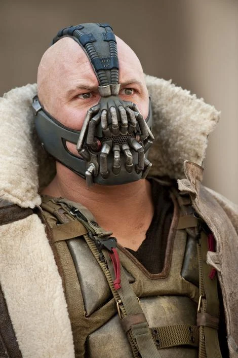
I thought it was Bane...

View attached image.
8 years ago
Permalink

Comment has been collapsed.

Check below.

8 years ago
Permalink

Comment has been collapsed.

Fun inspired this submission-- when Phoxy said FUN, I thought of this:

View attached image.
8 years ago*
Permalink

Comment has been collapsed.

This is something :D

8 years ago
Permalink

Comment has been collapsed.

Something... I guess that's better than nothing... ;)

8 years ago
Permalink

Comment has been collapsed.

Creepy comes to mind, not fun. :P

8 years ago
Permalink

Comment has been collapsed.

How is it creepy--? I spent so much time picking a clown face that was friendly and fun looking...

You must be one of those people that is afraid of all clowns...

8 years ago
Permalink

Comment has been collapsed.

Pennywise would disagree. I love IT. Hope my fellow Swede will do a good job in the tv show!

View attached image.
8 years ago
Permalink

Comment has been collapsed.

OMG there's a remake on the way?

8 years ago
Permalink

Comment has been collapsed.

Starring Alexander Skarsgård's younger brother, Bill, as Pennywise. :)

8 years ago
Permalink

Comment has been collapsed.

I just went to google it after the comment I left here, and I'm very curious about it. The 1990 miniseries is one of my favorite stephen king's adaptation, but this look promising.

8 years ago
Permalink

Comment has been collapsed.

Oh, and sorry. I said it was a TV show on its way, but it's a movie. Must have confused it with another show. :)

8 years ago
Permalink

Comment has been collapsed.

So do you like this version better?

View attached image.
8 years ago
Permalink

Comment has been collapsed.

Actually, yes. ^^

8 years ago
Permalink

Comment has been collapsed.

+1

8 years ago
Permalink

Comment has been collapsed.

Edited just for you!!

View attached image.
8 years ago
Permalink

Comment has been collapsed.

:D

For some constructive feedback, if you rotate and scale the two images so that the mouth and eyes line up, the effect will be even better.

8 years ago
Permalink

Comment has been collapsed.

Ill try that ...

8 years ago
Permalink

Comment has been collapsed.

I did it within animation here.

Here is rotating and lining up eyes before -- and then morphing--

8 years ago*
Permalink

Comment has been collapsed.

Looks cleaner and without as much distortion to the background. :)

8 years ago
Permalink

Comment has been collapsed.

RHAAAAAAAAAAAAAAAAAAAAAAAAAAAAAAAAAAAAAH There is a clown in your submission T___T

8 years ago
Permalink

Comment has been collapsed.

Maybe I should get rid of clown or go risk-kay and put in the evil one!!

8 years ago
Permalink

Comment has been collapsed.

glares

PS: I can't find the voting thread for last week's entries, is it up somewhere?

8 years ago
Permalink

Comment has been collapsed.

Not up so far. There has been some delay. But maybe we will be surprised and it will appear in the near future. So keep the voting tension in

8 years ago
Permalink

Comment has been collapsed.

Oh, it's all good then, I was just worried it had fallen in a pit of unbumped threads and i couldn't find it. No rush at all ;)

8 years ago
Permalink

Comment has been collapsed.

Up very very soon... Nordhbane just got all the info he needs...

8 years ago
Permalink

Comment has been collapsed.

I can give you a link, but Dan Sandy Nordh isn't happy when I'm finding it before he shows post.

8 years ago
Permalink

Comment has been collapsed.

Oh, I'm good I can wait, there is no rush I could dig for it too but it's no THAT much of a rush ;p

8 years ago
Permalink

Comment has been collapsed.

Link to VOTING Thread

8 years ago
Permalink

Comment has been collapsed.

Yay the first entry.........a "funny" clowns are scary!!!! lol one

8 years ago
Permalink

Comment has been collapsed.

Since I still suck at coloring it's a colorless entry for me. :)

http://i.imgur.com/ZWJKVyF.jpg

8 years ago
Permalink

Comment has been collapsed.

In the worst case you can always you did go for something unique. If you checked the older threads you have seen all kinds of colouring. So you can still think about it during the week. Some basic colouring should be doable fast and easy even with paint. But nobody will force you to do it ^^

And hey, maybe you will surprise yourself.

8 years ago
Permalink

Comment has been collapsed.

A b&w submission is better than none! As Adelion said, you can always play around with some color, never know what happens. ;)

8 years ago
Permalink

Comment has been collapsed.

Have less time this week so I tried something new and faster to achieve. So, here's my black and white taj Mahal version.

View attached image.
8 years ago
Permalink

Comment has been collapsed.

hehe I like it, it look like it could be out of a 8bit game :3

8 years ago
Permalink

Comment has been collapsed.

The best games ever _. I don't know why but I have more fun to play those old games than a lot of actual ones.

8 years ago
Permalink

Comment has been collapsed.

Cool result for not having much time ;)
I'm glad I don't have to decide whether that counts for the colored version or not. :P

8 years ago
Permalink

Comment has been collapsed.

It does count as colored... from the way I see it...

8 years ago
Permalink

Comment has been collapsed.

I love the way you look at it . :)

8 years ago
Permalink

Comment has been collapsed.

Black is also a colour! ;)

It's more about filling in details than about adding actual colours. :)

8 years ago
Permalink

Comment has been collapsed.

Bump for new giveaway added. ;)

8 years ago
Permalink

Comment has been collapsed.

Thanks for the bump! Err, I mean giveaway! Sorry, someone must have eaten my brain.

8 years ago
Permalink

Comment has been collapsed.

When we were first proposed, the morals of society prevented humans from creating living buildings. It only took 30 years for their situation to become so dire that they threw away their ethics in a vain attempt to lengthen their reign on a dying Earth. They used us to farm new organs for them when their damaged cells decided to multiply themselves instead of their species, and to create meats for them to eat when they depleted the last fragile ecosystems that had managed to survive the human's and the Earth's attack against life. We we human's survival and also their hope. Humans tried for centuries to create computers as intelligent in design as they themselves were until they decided to modify what nature has made instead of recreate it. And we could eventually think of an answer to save the human race and the planet. But it was too late, by the time we Figured out how to preserve human life, the Earth had reclaimed it's greatest creations. And now no one is left to reclaim us.Our fate is life, the thing we could no preserve in our creators. I have no mouth, and I must scream.

View attached image.
8 years ago
Permalink

Comment has been collapsed.

Your imagination goes from strength to strength. Now I know why: .......you're the world's one and only Tree...B

View attached image.
8 years ago
Permalink

Comment has been collapsed.

You ga must have been inspired by the brains inside TreeBs Mahal...

8 years ago
Permalink

Comment has been collapsed.

This week it's going to be a contest of who can make the creepiest buildings it seems. :D

8 years ago
Permalink

Comment has been collapsed.

Now THATS creepy!

Brains, skin, body organs... Yikes!

Could this be depicting the mind of a serial killer?

Love your creative writing skills with it, TreeB!

8 years ago
Permalink

Comment has been collapsed.

His writing might inspire a fantasy-story event. ;)

8 years ago
Permalink

Comment has been collapsed.

I have an idea for this one, will start colouring tomorrow.
Bump.

8 years ago
Permalink

Comment has been collapsed.

Can't wait . :)

8 years ago
Permalink

Comment has been collapsed.

Colouring finished(3 drawings), now I only have to merge them into 1.

8 years ago
Permalink

Comment has been collapsed.

Bump for aliens!
my submission

View attached image.
8 years ago
Permalink

Comment has been collapsed.

Sooo awesome it's out of this world!

8 years ago
Permalink

Comment has been collapsed.

That alien's got some swagger to it.

Does this mean Taj-Mahal is the alien's home base, or that they are about to destroy it?

8 years ago
Permalink

Comment has been collapsed.

They are very much at home. ;)

8 years ago
Permalink

Comment has been collapsed.

Taj-Mahowl's Moving Castle.
And Taj-Mahowl's Moving Castle Nordh's Edition.

View attached image.
8 years ago*
Permalink

Comment has been collapsed.

Deleted

This comment was deleted 5 years ago.

8 years ago
Permalink

Comment has been collapsed.

Yeup, I asked Jeff and Nordh when it was just a scetch.
Or maybe not.

8 years ago*
Permalink

Comment has been collapsed.

Deleted

This comment was deleted 5 years ago.

8 years ago
Permalink

Comment has been collapsed.

More spaceships! You stil have Kizhi Pogost for that!

8 years ago*
Permalink

Comment has been collapsed.

Я вообще английский не очень хорошо понимаю. К примеру, я даже не понимаю полностью комментарии, что мне сейчас написал Дэниел.

8 years ago
Permalink

Comment has been collapsed.

Deleted

This comment was deleted 5 years ago.

8 years ago
Permalink

Comment has been collapsed.

When you first showed me the draft and asked for permission for moving the towers around that much I told you that you had to keep it to scale and to use the original connect-the-dot lines for the legs. Your legs are scaled down a lot, plus it uses a cleaned up version of the tower shapes (and if my eyes aren't deceiving me, the outlines are copy-pasted?). This is a really good idea and execution for what it is, but I told you very specifically what you needed to do to get such an extreme change qualified, and it's like you ignore that. I hope you can rework those legs to fit scale and use the actual lines from the dots.

It looks like the chimney's on top follows the dot-lines more properly than the legs do, but there the tops are cut off, and the detail of the section dividers are quite a bit too hidden to see for sure.

8 years ago
Permalink

Comment has been collapsed.

I didn't understand you about scale, sorry, that happens. Pipes are maybe copypasted, I don't remember, legs - definitely not. I didn't use "clean" version of legs, I just hide those lines via design but they are still on picture.

8 years ago*
Permalink

Comment has been collapsed.

Then the legs don't follow the dot lines. If you check on the upward side of each tower, it's an almost 90 degree angle. You have the same smooth angle both top and bottom. On the chimneys I can see your dot-lines through the very dark colour (just below the top red arrow), and there those angles (top arrow) are more like the real towers than what we can see on the legs (bottom arrow).

View attached image.
8 years ago
Permalink

Comment has been collapsed.

That's because I add new lines.

8 years ago
Permalink

Comment has been collapsed.

Check 2nd one.

8 years ago
Permalink

Comment has been collapsed.

Do you need hint about what still is wrong?

8 years ago
Permalink

Comment has been collapsed.

Much better, now we can see the original lines and it's to scale. Approved!

8 years ago
Permalink

Comment has been collapsed.

I just now noticed that I forgot about rectangular base at the bottom. >^____^< And there is no room for it anymore.

8 years ago
Permalink

Comment has been collapsed.

This is

View attached image.
8 years ago
Permalink

Comment has been collapsed.

I like the 2nd. One much better! Larger legs are more stunning!

8 years ago
Permalink

Comment has been collapsed.

I don't. But rules are rules.

8 years ago*
Permalink

Comment has been collapsed.

Deleted

This comment was deleted 5 years ago.

8 years ago
Permalink

Comment has been collapsed.

That's amazing! I had a similar idea with drawing the water and have a reflection, but going for another style where it doesn't fit. :)

8 years ago
Permalink

Comment has been collapsed.

Deleted

This comment was deleted 5 years ago.

8 years ago
Permalink

Comment has been collapsed.

Check below. :) Now you understand why there can't be a reflection. ;)

8 years ago
Permalink

Comment has been collapsed.

Beautiful work of art. I love it. :)

8 years ago
Permalink

Comment has been collapsed.

Deleted

This comment was deleted 5 years ago.

8 years ago
Permalink

Comment has been collapsed.

Wow! This is Gorgeous! Awesome, AlexeyFN!

8 years ago
Permalink

Comment has been collapsed.

Deleted

This comment was deleted 5 years ago.

8 years ago
Permalink

Comment has been collapsed.

This challenge I decided to create the groundwork that all buildings need before they are erected Tiihiii, he said erected, because without blueprints, there can be no landmarks.

View attached image.
8 years ago
Permalink

Comment has been collapsed.

Deleted

This comment was deleted 5 years ago.

8 years ago
Permalink

Comment has been collapsed.

Yea, maybe there is even an engineering font.

8 years ago
Permalink

Comment has been collapsed.

It's intentional. Supposed to look less like computerprinted, and more like old style script. Not to mention, there are no important elements in the text. A lot of old documents are hard to read because of the handwriting, I wanted to mimic that.

8 years ago
Permalink

Comment has been collapsed.

Deleted

This comment was deleted 5 years ago.

8 years ago
Permalink

Comment has been collapsed.

Not that easy to find a good free one. :P Changed it a bit though.

8 years ago
Permalink

Comment has been collapsed.

Deleted

This comment was deleted 5 years ago.

8 years ago
Permalink

Comment has been collapsed.

Is it denied because you didn't use proper font?
Edit: meh, people already joked about it. Twice.

8 years ago
Permalink

Comment has been collapsed.

Very realistic for the effect you were aiming at. take it from someone who knows ;) Once again a great creation.

8 years ago
Permalink

Comment has been collapsed.

Or at least a realistic fake that you would see in movies, rather than in real life perhaps? =)

Are you an architect by any chance?

8 years ago
Permalink

Comment has been collapsed.

It's a rather good fake. :)
No, I sadly haven't fullfilled that dream yet. Life got in the way. :D
But I did spend some time on drawing boards. ;)

8 years ago
Permalink

Comment has been collapsed.

Damn you, life! Damn you! Always getting in the way. ;P

8 years ago
Permalink

Comment has been collapsed.

Where's draft #1 to #3? :P

8 years ago
Permalink

Comment has been collapsed.

Garbage bin. They too were Denied! :( Hopefully Draft #5 will be accepted so we can start building the Taj Mahal.

8 years ago
Permalink

Comment has been collapsed.

You can add another dot-to-dot inspired by disney to the list.
I put the towers closer to eachother and removed the box underneath, if this is unacceptable, just say so.

View attached image.
8 years ago
Permalink

Comment has been collapsed.

I love you that you used paper and coloring pens to create your submssion.
It looks very nice. Disney all the way !!!

8 years ago*
Permalink

Comment has been collapsed.

Thanks, I used it for all my entries so far and no intention of changing that.

8 years ago
Permalink

Comment has been collapsed.

Lovely!

8 years ago
Permalink

Comment has been collapsed.

Very cool. And before anyone asks, the cutoff of the dotlines is minimal and is accepted. :)

8 years ago
Permalink

Comment has been collapsed.

Very nice drawing skills...!

8 years ago
Permalink

Comment has been collapsed.

bump

View attached image.
8 years ago
Permalink

Comment has been collapsed.

We are all mad here =)

View attached image.
8 years ago
Permalink

Comment has been collapsed.

I'm not. I've honestly stolen 2.5 ideas.

8 years ago
Permalink

Comment has been collapsed.

Your Wild-Wild-West Submission? :)

8 years ago
Permalink

Comment has been collapsed.

It's a cat with a nipple for a nose!

8 years ago
Permalink

Comment has been collapsed.

Well uhm... xD

8 years ago
Permalink

Comment has been collapsed.

There is no Wild Wild West! There's only Hayao Miyazaki, The Journey and Evil Sheep's secret texture technique. But last one I stole from Nordh after he stole it from Sheep so it's not my sin.

8 years ago
Permalink

Comment has been collapsed.

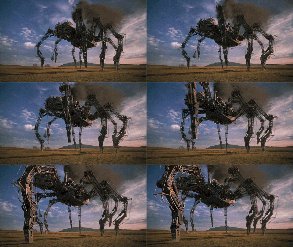
Somehow it reminded me of this

View attached image.
8 years ago
Permalink

Comment has been collapsed.

It's bad movie, I'm not gonna steal anything from it.

8 years ago
Permalink

Comment has been collapsed.

It wasn't about stealing, just getting ideas. And yes, it definitely is a bad movie. Will Smith turned down playing Neo in Matrix to make Wild wild west instead xD

8 years ago
Permalink

Comment has been collapsed.

View attached image.
8 years ago
Permalink

Comment has been collapsed.

Thank you, you too :)

8 years ago
Permalink

Comment has been collapsed.

So in one submission we have "We all float down here" and in another we're all mad here. This weeks has been so weird!

8 years ago
Permalink

Comment has been collapsed.

I like your kind of mad . :)

8 years ago
Permalink

Comment has been collapsed.

Nice... a Taj Mahal pink Kitty nose! Love it!

8 years ago
Permalink

Comment has been collapsed.

Pffiou, I almost thought i'd have to skip this week. The other will have to wait tomorrow, I'm falling asleep on my keyboard.

View attached image.
8 years ago
Permalink

Comment has been collapsed.

Yay! Now I have to do smth with Kizi to have chances to beat you!

8 years ago
Permalink

Comment has been collapsed.

You're already beating me so I'm not sure what you're talking about :/

8 years ago
Permalink

Comment has been collapsed.

After this week you will get to windward of me.

8 years ago
Permalink

Comment has been collapsed.

I don't think so, you're entries are always greater than mine and this week is no exception ;)

8 years ago
Permalink

Comment has been collapsed.

I mean this voting week. Nobody votes for my castle, so if I'm right and hosts wouldn't choose me or Jeff you will be on 1st place.

8 years ago
Permalink

Comment has been collapsed.

Btw, you have strange light source. With domes and towers shadows it should be on the right. But according to shadows in arcs light is on the left.

8 years ago
Permalink

Comment has been collapsed.

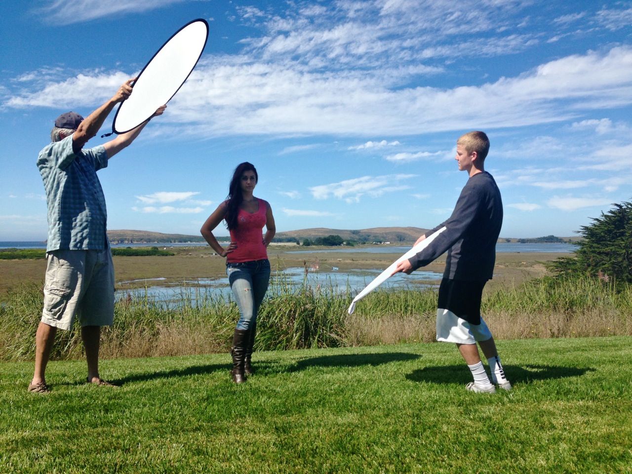
Just someone using a reflector!

View attached image.
8 years ago
Permalink

Comment has been collapsed.

Like I said I was tired, I had a long day of work. I don't think I'll correct it though, I don't really mind that much for it to bother me.

8 years ago
Permalink

Comment has been collapsed.

Really nice work, yet again. =)

8 years ago
Permalink

Comment has been collapsed.

Thank you :)

8 years ago
Permalink

Comment has been collapsed.

Glad you didn't skip it... this is beautiful!

8 years ago
Permalink

Comment has been collapsed.

Thank you :3

8 years ago
Permalink

Comment has been collapsed.

Heres my entry

View attached image.
8 years ago
Permalink

Comment has been collapsed.

Very colorful. Awesome :)

8 years ago
Permalink

Comment has been collapsed.

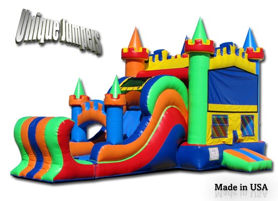
Looks like a bouncy house! Yay!

8 years ago
Permalink

Comment has been collapsed.

View attached image.
8 years ago
Permalink

Comment has been collapsed.

I had an idea to make it like the hope in the despair, a place in the rays of rising sun when the night ends. OR SOMETHING. :D

View attached image.
8 years ago
Permalink

Comment has been collapsed.

It sure is something really cool! ;)

8 years ago
Permalink

Comment has been collapsed.

Wow... deep stuff going on here...

Powerful!

8 years ago
Permalink

Comment has been collapsed.

All work and no play makes Jack a dull boy.

8 years ago
Permalink

Comment has been collapsed.

My entry:

View attached image.
8 years ago
Permalink

Comment has been collapsed.

Might have been better for the Kizhi Pogost entry?

View attached image.
8 years ago
Permalink

Comment has been collapsed.

Is that texture made from bread?

8 years ago
Permalink

Comment has been collapsed.

I have no idea :)

8 years ago
Permalink

Comment has been collapsed.

How did you make the textures?

8 years ago
Permalink

Comment has been collapsed.

Googled it.

8 years ago
Permalink

Comment has been collapsed.

Interesting textures. ;)

8 years ago
Permalink

Comment has been collapsed.

View attached image.
8 years ago
Permalink

Comment has been collapsed.

It's like a sandstorm!

8 years ago
Permalink

Comment has been collapsed.

I'm getting an oasis kind of feeling with the green grass. :)

8 years ago
Permalink

Comment has been collapsed.

A Taj Mahal getting high on grass! :)

8 years ago
Permalink

Comment has been collapsed.

View attached image.
8 years ago
Permalink

Comment has been collapsed.

Looks like an artist impression matching to Nordh's blueprints. I really like the effect. =)

8 years ago
Permalink

Comment has been collapsed.

Our entries actually do form part of a building proposal. It's just lucky we could use them here!

8 years ago
Permalink

Comment has been collapsed.

Yours is like that image that you can show to the client how it would look like when my blueprint is finished. :)

8 years ago
Permalink

Comment has been collapsed.

A really bad rendering. Or the printer's out of ink

8 years ago
Permalink

Comment has been collapsed.

Can only print green colours ^^

8 years ago
Permalink

Comment has been collapsed.

Very nice shading under the overhangs!

8 years ago
Permalink

Comment has been collapsed.

Thanks, jefifah

8 years ago
Permalink

Comment has been collapsed.

I invert the colors on this one :)

View attached image.
8 years ago
Permalink

Comment has been collapsed.

That looks quite interesting. It's giving me ideas for next week.

8 years ago
Permalink

Comment has been collapsed.

Nice icy pop colors! Yumm!

8 years ago
Permalink

Comment has been collapsed.

Very lazy arabian night:

View attached image.
8 years ago
Permalink

Comment has been collapsed.

Heh, now we have two night themes behind each other ^^ So this is how my picture could look if I had actual talent in computer assisted drawing. Would have been cool if you had integrated the stars into the lines. Like the zodiacs in the night sky.

8 years ago
Permalink

Comment has been collapsed.

Awesome effect!!! =)

8 years ago
Permalink

Comment has been collapsed.

Queue the Star Wars theme. A long time ago, in a palace far away.

8 years ago
Permalink

Comment has been collapsed.

Now that would make an awesome neon tube sign!

8 years ago
Permalink

Comment has been collapsed.

Apparently I'm not able to differentiate a red tone from a purple/violet one .... Well, at least one time in my life I had an actual use for GIMP. Here is the album how that violet nightmare turned into the yellow (wishful golden) Taj Mahal at night time. If I had talent I could have tried to integrate a light gradient somewhere .....

View attached image.
8 years ago
Permalink

Comment has been collapsed.

That's a great effect, too. Did you do that by hand?

8 years ago
Permalink

Comment has been collapsed.

Which effect? Picture is drawn by hand and then modified on PC to get the actual colours I had in mind.

8 years ago
Permalink

Comment has been collapsed.

The effect of having a real hand drawn piece of art. ;)

8 years ago
Permalink

Comment has been collapsed.

The shading almost makes it look like a sandstorm has started piling up sand on the side of the building. :) Great use of inverted colours. I guess that what you did? And if so, how did you get the grass in such a good green colour? Did you invert green and see what you had to paint it with to make it flip back to green afterwards? =)

8 years ago
Permalink

Comment has been collapsed.

If you check the album you will see the original painting I had created. Yea, I used inverted colours. I really liked that night effect I got for the black edition for Neuschwanstein. It is something I could never establish if I try making it by hand so I just had to invert the white. This meant that I also had to invert all other colours .... As in the description for the Taj Mahal given by Phoxy I tried to create a golden version at night. But the thing I though was purple was probably more red than I noticed (notice how the first inverted picture has green grass and a green Taj Mahal ....) The green worked like intended. I used red for it. The water actually came out really nicely in the way I wanted to.

For the final adjustment I used GIMP where I can invert and change the colour of parts only. I changed the the Taj Mahal to a more yellow tone and darkened the lower part since it was to bright for being at night.

Hm, the lemon green version doesn't look to bad either and the river is more interesting there. Maybe I'll change it. I still can do it until the countdown ends I assume.

8 years ago
Permalink

Comment has been collapsed.

Definitely think you chose the best version of those. :) Perhaps, if you want a bit more glowing, take the grass for the second to last one.

8 years ago
Permalink

Comment has been collapsed.

Heh, thanks. Maybe I try out replacing only the river. Checking if that one is a bit more glowing. Still have around two hours. And you don't think the original Barbie-Like version is any good? The brightness could burn out people's eyes ^^

8 years ago
Permalink

Comment has been collapsed.

That is simply wonderful!

8 years ago
Permalink

Comment has been collapsed.

Closed 8 years ago by Phoxy.